Um..Hey! I've hung around SonicHQ for years, but I never stopped by the forum. So now I have! Anyway, I thought I'd share a bit of my work with you.

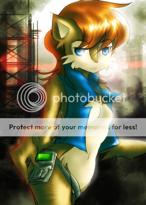

A collab with Emmychida. I did the lines, she colored.

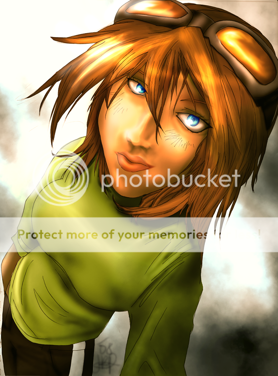
I'm a fan of Elias from the Archie comics.
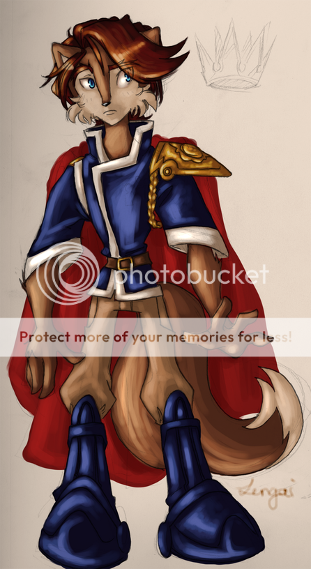
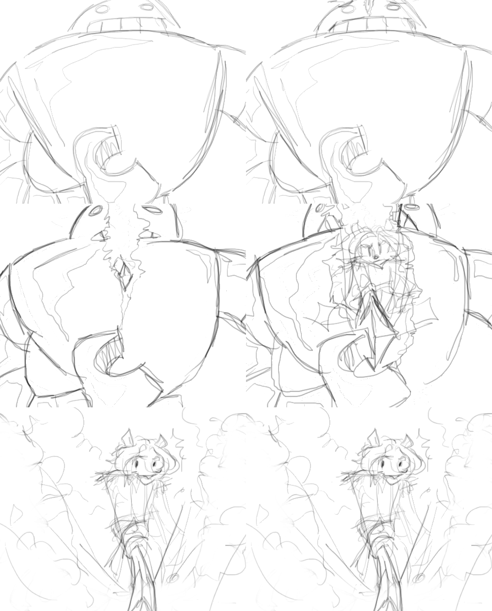
Speaking of which, I've also been working on a fan comic that deals with some of the Archie Sonic's more minor characters. Five pages are done as of now.


I'm going to be brutally honest here and tell you that you're so damn artistic. Keep up the good work!
The first one you've got up I like the best. Whatever it is you're doing, don't stop!
Thank you! ![]()
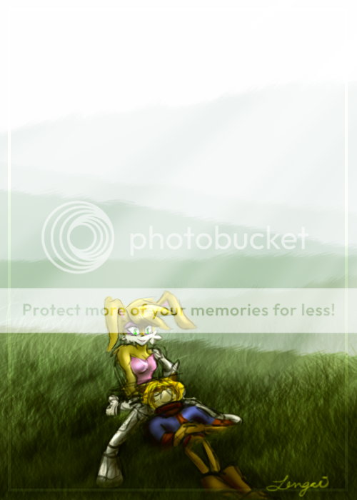
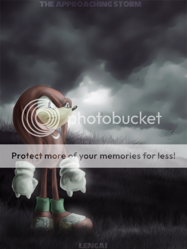
I was a busy bee last night and also did this.
these are beautiful. you have a great coloring style and i like your angular lineart. the only real complaint i have is that the perspective seems screwed up in the third picture, and her shoulders seem too thick.
Well, it's been a while since I've broken out the ole' critique hat, so lets see if I still have it in me, eh?
Cheetah hottie perfoming some kind of divination
Hawt diggidy dang, this picture is good. Very good indeed. From anatomy to design to effects it all clicks, there isn't much to say about this, but it sets the high benchmark for your works being the first ;3
Ground Skwrl hottie performing an infiltration
Hrmmm... Now, I like seeing pictures of Sally personally, but something in this jars. It isn't the background, that is perfect, a grim bleak distopian print despite the bright colour of the sky. It's not the composisitioning, which again is good, it's simple and plain, sure, but it works. The pose is fine, it shows her physique but also some action. The colouring is good as a whole, but there is a large overuse of lensflare effects on the edges of objects and especially Sal's arm
What lets this down I fear, is the shear roughness of the lines. Sometimes rough looks good, this is true. This ain't a case. Clean those lines up and you have a class act Pinup.
Lynx hottie perfoms perspective illusions/
I...okay this is why I stopped critting things and whent from several paragraphs a post to like, one line. Too lazy, I'll crit the rest later.
Ah, I've seen some of your art at SVT's forum. Fantastic work. =D

