....It's been awhile. And I had to when I got my new desktop theme. I just have to show you guys the beauty of my non-Hotaru theme:

So (aside from claims that my desktop will EAT YOUR SOULMWAHAHAHAHAHAHA), who else wants to post what their desktops look like?
How does one print the screen on a Mac exactly?
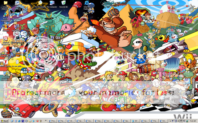
Multiple open windows FTW.
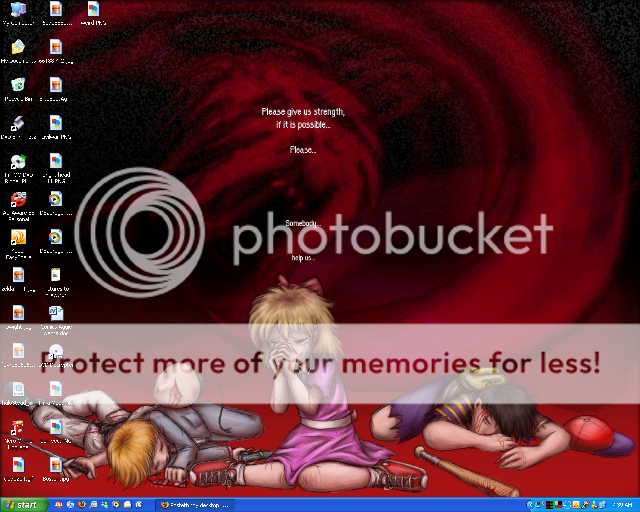
Ultra, the only reason to have that many windows open is if you are looking at porn...
Tabbed webbrowsing FTW
Actually, it's from a news site, and I'm reading one story at a time.
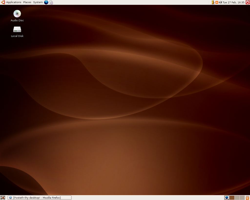
That's the default desktop for Ubuntu. I haven't gotten round to changing it yet.
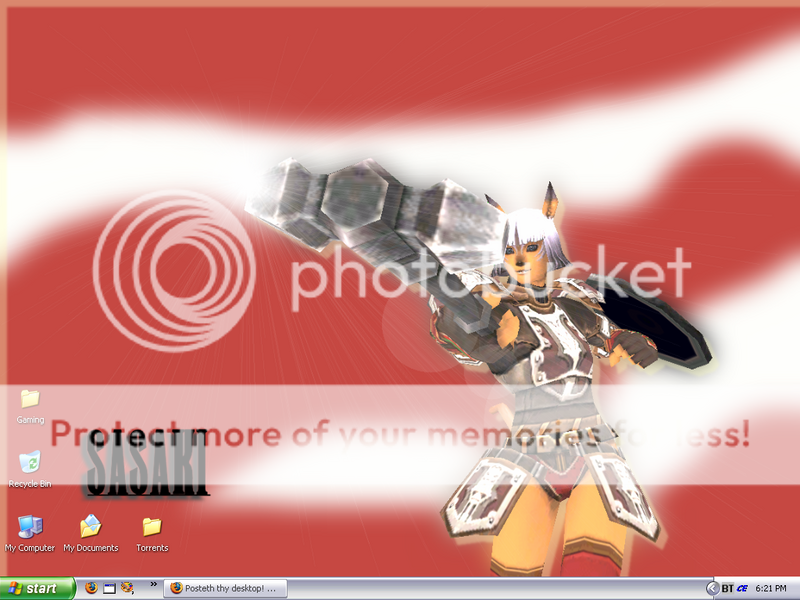
Suffering FFXI withdrawals i.i
EDIT: wtfmates. >>
View from the Sears Tower when Craig and I went. This is his photo. Admire it and its sunset-y glory. 😀
~Shadowed Spirit Sage
O_O @ Sage
Quick, hide the evidence of this illegal script, before the SWAT team arrives!
PC Desktop, hasn't changed much from this old screenshot, just some outdated icons.
And now, here is my laptop desktop (shrunk down from 1280 x 800)

Wallpaper is a screenshot from episode #488 of Pokmon. I wish I had enough icons to make the pyramid shape my Desktop icons are in. Oh well.

Yey vgcats.
Rat...MORNINGSTAR! Jin wins the thread, again.

~Tobe
I knew I should have gotten the first post in this while I had the chance.
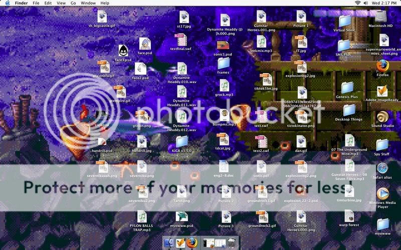
Dang Photobucket always resizing what they think is too big. Its Ecco!!! Ecco rates a 8.4 on the Spanky scale. (For refrence Flipper is like a 3.2)
It always wierds me out how grid-like American cities are.
It's only cuz we're newer and have much more space to work with that we've had time to better figure out how to put cities together than in already developed cities in the world that have been around for like hundreds and hundreds of years.
Then again, you have @#%!holes like Rockford, which the people who put it together are a bunch of morons and just kinda went WHEEE on a chalkboard and said "CITY! ![]() "
"
Fake Edit: @A%! my server is down. Grrr. ![]() :">
:">
Fake Edit 2: ... I won again? When was the first time?
How does one print the screen on a Mac exactly?
I think you need to use Grab, which is in the ApplicationsUtilities folder.
I want one of these for myself:

Oh, I know why American cities are like that it. It's just it seems wierd to me, what with growing up in Britain where cities are completely haphazard due to having grown up in most cases from small villages over hundreds of years and also due to the extremely rapid growth that a lot of the biggest cities underwent during the industrial revolution.
I love when cities are gridlike, with a random lazy diagonal breaking everything up. ^_^
What I don't like are those new kind of subdivisions that get made, that are like a little road that connects from this main road that passes by to a bunch of these curvy roads than are never strait for 5 meters with long "blocks" that actually are the streets canceling each other out. The trees (if any) are fake placed and the houses are all the same with no history behind them, if any the land used to be a forest or prarie or a farmland that was taken by the government. (alot of farms today get paid -not- to farm, because we have too much food to go around but apparently the rest of the world is starving to death does this make any sence?) And the people, they think living in midtown, the actual town that was made many years ago, is where gangs happen and people get shot...thinking its the best place to raise their children, going to schools with children just like them, making all the more problem when they finally see a child of another race and they aren't taught what to say or how to act. These are the future high schoolers of America. Not to mention that if there is a walking/bike path that goes near them there can be some really rude ones. If you are even in their community or a park next to their community they call the police if you stay too long.
And don't get me started on the names of the streets. "Honeysuckle Ave?" "Gated Ln?" "Clearview Bvld?" "Forest Dr" when they cut down all the forest and brush to make the community in the first place? I might be biast, but these kinds of communities are sprouting up at a frightening pase. And whats worse is that they are burning the candle at both ends. Now the Dekalb/Sycamore area are building up like crazy and pretty soon there will be no natural land left.
Well, as long as all the cool kids are ignoring the existing thread (now where have I seen something like this before), I might as well post here too!
Deck, your desktop is awesome because of the PA book cover.
Your desktop is also not awesome because of the god awful icon replacements. Didn't that fad die out with Windows 98... and the age of 13?
Quote:
Well, as long as all the cool kids are ignoring the existing thread...
Not just the cool kids. Everyone. Know why? Cuz it's MF2. Which I still think it should be changed to something along the lines of "That board that nobody really cares about" or "Screw you and just post here or something", or maybe "Love me? ![]() "
"
That's just me, though.
Currently it's:

Quote:
Your desktop is also not awesome because of the god awful icon replacements. Didn't that fad die out with Windows 98... and the age of 13?
I don't care. I don't see anything wrong with my icon replacements.
Quote:
Not just the cool kids. Everyone. Know why? Cuz it's MF2. Which I still think it should be changed to something along the lines of "That board that nobody really cares about" or "Screw you and just post here or something", or maybe "Love me? 🙁 "
Noone uses the forums like they're supposed to. Look at SPA, it's taken over as MFC. MFC is now MFC2. And MFC2 is.. well not used.
~Tobe
How the hell is MFC now MFC2?
MFC2 = nothing. MFC2 was SUPPOSED to be, at first, a forum to throw in threads that were over 50 posts, but people could still participate in them. Then 75... and then after that people just stopped caring, so it kind of became like a little garbage can.
I don't see how MFC = MFC2 now. Unless you're saying all posts made in MFC are @#$! posts, in which case, a good amount of my time here now recently, I'm inclined to agree.
My desktop?
This probably won't mean anything to anyone who isn't from the UK, of a certain age and watched a particular TV series, but it currently looks like this (apologies for it looking a bit squished - the original image is 1280x800).
For anyone who does fit that description: with the exception of the wallpaper, I made it myself. Unfortunately, that pic can't show off the full icon set or animated cursors. 🙂
I may post the raw materials to my LJ once I've finished the complete icon and cursor collections and the sound set. Let me know if you're interested. 🙂
Well considering that MFC used to have a branching layout, but it's now tabled and threads that would move after 50/75/"whatever the current cut-off was" are staying in MFC, I can see why this is considered MFC2-like now.
As for the topic at hand, I don't feel like taking a screen shot... so if you want to see it go here, the February wallpaper is what I'm using now.
Ask and you shall recieve.
Just don't say I didn't warn you ![]()
i34.photobucket.com/albums/d145/xagarath/desktop.png
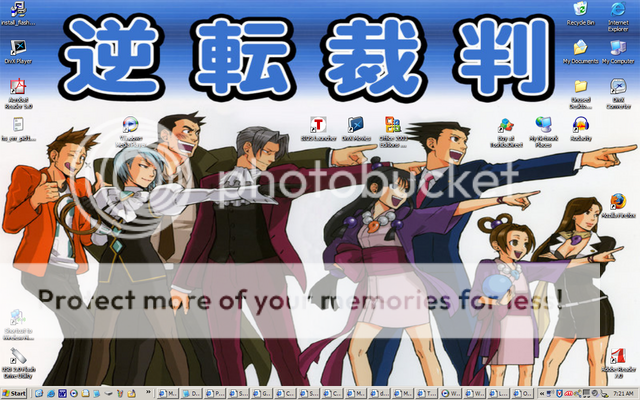
Because not enough things in my live are focused on wolves, or pirates...

Boo for Buttz and Mia for not joining in the awesomeness. Or rather, OBJECTION to Buttz and Mia. :b

I usually hide my ugly, image-obscuring icons. SotC is so awesome.
w00t for Opera and lack of icons. me likes. ![]() I have a similar set up, although in my case I've gone so far as to completely disable/remove every icon from my desktop. I love the cleanliness, and I never used them anyway. The only icons ever present on my desktop now are temporary things that will usually either be deleted or moved to a permanent location shortly, and I usually keep that stuff out of the way over on the second monitor. woo hoo.
I have a similar set up, although in my case I've gone so far as to completely disable/remove every icon from my desktop. I love the cleanliness, and I never used them anyway. The only icons ever present on my desktop now are temporary things that will usually either be deleted or moved to a permanent location shortly, and I usually keep that stuff out of the way over on the second monitor. woo hoo.
Yay for icon-less desktops. ![]()
About the only purpose the desktop serves to me is somewhere to put a pretty picture to look at when ever I start up/shut down my computer or happen to close down all the programs I'm running. I access everything via menus, quick launch icons and (moreso on Linux than Windows) the command line.
*jumps into the fray!*
I'd taken this screenshot over the weekend, and I'm finally getting around to posting it. ^^;
BEHOLD! I would have just resized, but then it would look fugly. =(
The icons are ruining the lovely Dragon Quarter art. 🙁
I know. I should have just disabled them. ><

Screenshot I took of my favorite character (Vlad Masters/Plasimus) in Danny Phantom in all his sexy glory (with black bars, leaves, and texts made through MS Paint and photoshop).


