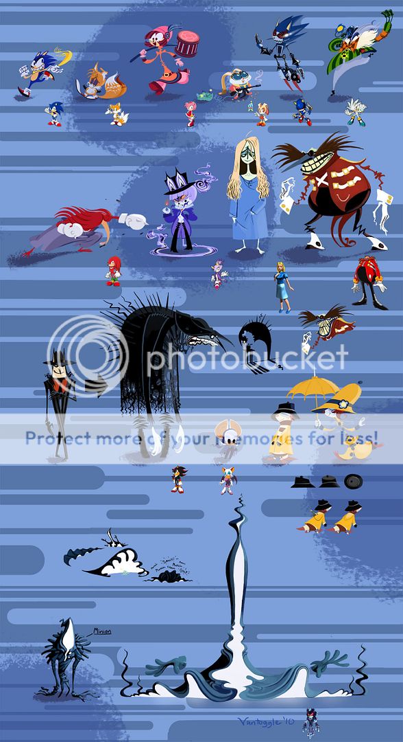
Retro has this thread, so why not us? Out of all of the pictures and artists there, one stood out by the name of Vantoggle.
Edit: Uploaded to my own account.
Well, I don't think I'd actually redesign the cast at all. I'd just change Knuckles' eye color to "blue" instead of "purple." Otherwise, I think I'd leave them all alone.
That was a very interesting take on the Sonic crew though.
The designs are among the biggest reasons Sonic became a hit and has managed to stay somewhat relevant.
I would only do minor convergence type designs like:
Make Sonic more of a mix of SA and classic. Unleashed pudginess is ideal.
Make Vector more like the original design, skinny and agile but with some of the better Heroes features.
Make Espio more of a purple rather than Magenta and add some green.
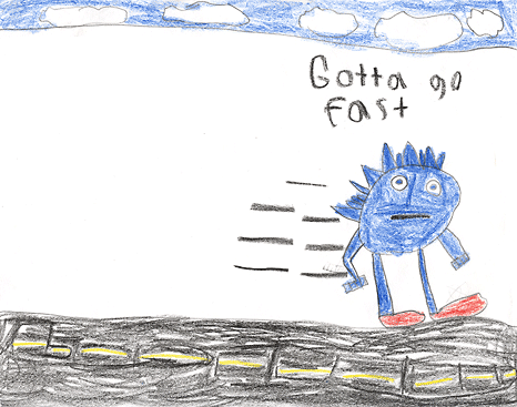
LOL! Awesome nuke. But in that original redesign...I don't even recognize some of those in their normal forms. o.o
Make Vector more like the original design, skinny and agile but with some of the better Heroes features.
Just outta curiosity, Vec, what do you consider to be the better features of Vector's Heroes design?
actually i was thinking about vector before too...... see he's the only sonic character that looks like what its supposed to be. he's green like a crockdile... has teeth and those lines in his tummy... you cant mistake him for another animal... though all the rest of the sonic characters are bizzare animals... there's no way you could tell sonic was a hedgehog if it wasnt mentioned, there arent blue hedgehogs and there's defiently no spikes like in that way on them either....
i think they should've giving vector a less real or common desgin for a crockdile.. we seen his design a million times in cartoons... at least they should've made him purple or gold or something other than the usual green. he's the most least thought of design in my opinion. i do like him and he looks nice but that's just how i feel about vector.
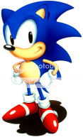
XD though if i'd redesign sonic characters (And this is just for fun cause i like them now too) but if i would this is what i'd do really, just these three bother me:

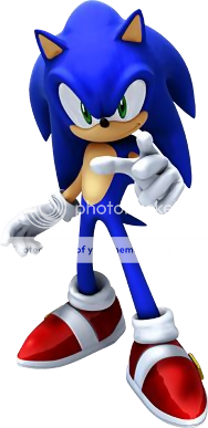 =
= 
 =
= 
 =
= 
 =
= 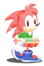
... yeeeeah, something like that... ![]()
Can we just accept the old characterisations are dead?
Sega themselves said that they 'matured' the characters look-wise, thus those are no longer applicable...and it's not likely we'll see them again. o.o

sonicsfan1991's Eggman is the bestest Eggman ever.
I definitely didn't really like the adventure era redesings and think some better redesings are in order, but the newer Sonic Unleashed ones we have now are the best that they have done with them and I don't mind it if stays. How I would like then redesigned, I don't know, but I definitely would like them a little less plastic looking.
Classic was much better by a long shot, and I don't mind if Uekawa or somebody else designs the newer characters into the older style just to see how they look -- for it would be glorious.
For Tails and Knuckles, there was never much change from pre-Sonic Adventure to their "newer" designs for me. They became "thinner" really (and Knuckles had his tail permanently bent in a "lightning"-like shape). I actually like the fact that Sonic and Amy both lost the "Mohawk"-like look due to their updated designs. For Sonic (like Tails and Knuckles), I never saw some huge massive change though.
As for Amy, I much prefer her red/white dress/boots to her prior outfit.
sonicsfan1991's Eggman is the bestest Eggman ever.
waaaa thanks dear <hugs> i just gave him a belly lift 😛
and yeah i agree at the less plastic look for sonic characters. my problem with sonic's spikes now is that they're too long and going down so it doesnt feel like he's been running top speed a lot.
true red, i like amy's design and clothes too but i'm not sure her clothes are fitting her age... though after sonic and tikal she's my favorite XD and her new hair is much cutier than the old one.
The only real major thing I would do is have Knuckles's snout return as well as his square head.
Maybe give Amy and Cream something new to wear.
Other than that I really dont mind the Adventure style stuff.
I prefer Adventure style to old style anyday. The old Robotnik is just hideous when I look back on him. It's no wonder the Western Sonic cartoons changed his look. When I first saw the SA Eggman redesign I was like, "Now there is a villian I can love." He retains the goofy look that Sega was going for while at the same time looking a little more sinister. Sega almost ruined this look with the horendous Eggman redesign in 2006, but luckily they saw the error of their ways. I will agree to the previous statements that Amy definitely needs a new outfit. Actually I wouldn't mide seeing more of Amy's Sonic Riders outfit. It was simple yet sharp. It would be a shame to keep that locked to a game I can barely play.
I love Amy's Riders outfit. I also love Rouge's Riders outfit. They could both wear those more often. ^_^
i agree they looked wonderful.
pants is the now style anyway no need to go so mini mouse huh? i didnt play sonic riders that much though so i only remember amy's clothes but this looks good.

It would definitely do for a change of pace. As far as Rouge goes it would probably actually be better if she wore a different outfit every game. For someone who adores jewelry she has to fancy herself high class. A wide assortment of outfits would fit her personality almost perfectly. I actually thought Sega might take this route when I played Sonic Heroes and saw that she had new gear. Guess I was wrong.
that's right now that i rechecked, rouge did wear different outfits in sonic adventure 2 and in sonic heroes (funny i never noticed before):


I guess thats what they were going to do (give Rouge a new costume every game) but then someone from Japan probably got a bit annoyed with that plan and then Sonic Team took that criticism on board and went back to her heart gear in Shadow.
I could understand why they didn't change her gear in Battle. Too many pixels... to change.
I suspect if her heroes outfit had been better, that plan may have continued, but it wasn't, and I don't like her SA2 outfit either. Her riders outfit is the only one that doesn't look ridiculous IMO.
I seem to recall a bit of a fan backlash when her Heroes outfit was first revealed.
Both it and her SA2 outfit look like superhero costumes rather than functional attire. The Riders outfit was more down-to-earth, and was better received.
hey that xmen rouge design is the coolest for her actually XD
what puts me off of her original outfit is the gloves and boots they have lumps of some sort. i never got why she has those, if she was a mole i'd understand her having big hands for claws. but pink and black is very good on her. i really like rouge even if her clothes dont work for me all the time.... btw what about sonic olympics? what was her clothes there? or was she not there?
oh and btw i hate that jewel on blaze's head i dont get what its for its driving me nuts looking at it.
GT - that image you linked to isn't working, any chance of a fixup?
Done.
I don't recall Rouge being in the lineup of the Olympics games. Amy Rose and Blaze were there, though, and I guess they only needed two girls to fill their quota.
Never thought I'd see rouge figure skating. Silver on the other hand, I could see doing so. I would probably redesign Silver completely. As character I thought he had a lot of potential, but it all was wasted due to horrible scripting.

